


To plot a fan curve you need measured or manufacturer data showing how airflow, pressure and power change at different operating points for a given fan speed. From these data you graph pressure versus flow, often alongside efficiency and power curves, to create a complete performance chart.
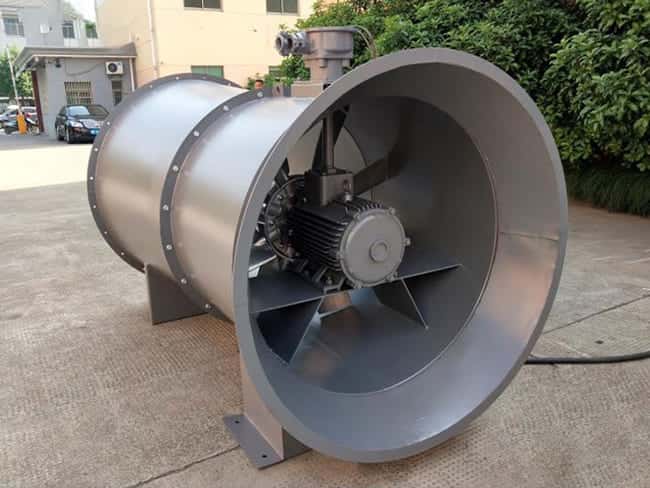
The first step is to collect data. In a test laboratory, a fan is mounted in a standardised test rig with instruments for airflow, pressure and power. At constant speed, the damper on the discharge is adjusted through a range of positions, from near closed (low flow, high pressure) to almost fully open (high flow, lower pressure). At each setting the tester records:
- Airflow (for example, m3/s or CFM)
- Static or total pressure developed by the fan
- Input power or brake horsepower at the shaft
Once you have these readings, you can plot the basic fan curve. On graph paper or in software, place airflow on the horizontal axis and pressure on the vertical axis. Mark each measured point and then draw a smooth curve through them. This is the pressure–flow or P–Q curve at that specific speed. You can also plot separate curves for static pressure and total pressure if both were measured.
Next, you can add power and efficiency information. Using the measured power and the calculated air power, you determine fan efficiency at each point. On a second vertical axis, plot brake horsepower (or kW) against airflow to form a power curve. Efficiency can be shown as a third curve or as labelled contours. The result is a standard performance chart with three pieces of information: pressure vs flow, power vs flow and efficiency vs flow.
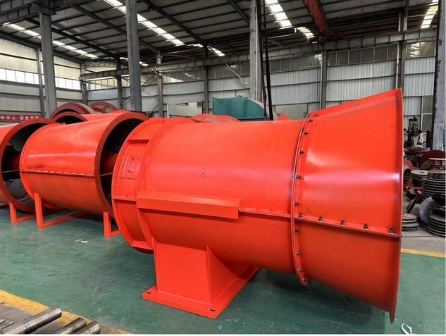
In industrial and mining ventilation design, engineers often need fan curves for multiple speeds. Using the fan affinity laws, you can approximate additional curves by scaling the tested data to higher or lower speeds, or use manufacturer charts that already include several speed lines. These families of curves help you see how the fan behaves with variable-frequency drives or different pulley ratios.
Finally, to apply the fan curve you overlay or compare it with the system resistance curve that represents your ducts or mine airways. The intersection point shows the expected operating airflow and pressure. If this does not meet your ventilation requirement, you select another fan or adjust system design, then repeat the plotting and comparison process.
In summary, plotting a fan curve means gathering flow, pressure and power data at constant speed, graphing pressure versus flow, and adding power and efficiency information. This chart then becomes the primary tool for matching a fan to an industrial or mining ventilation system.